There’s a multitude of online touchpoints your customers can engage with to reach your business. Therefore, it can be difficult to tell what your best traffic sources are and where you should invest your time and marketing dollars.
Luckily, Google has added a function to Google Analytics called “Multi-Channel Funnels” to help you to identify when, where, and how customers find you online and what your best sources of conversions* are.
*Note: “conversions” in digital marketing terms means prospective customers who take a specific action you want. For example, the following are specific conversions that an organization may track: website visitors who fill out a form, call your company, or purchase something from you online.
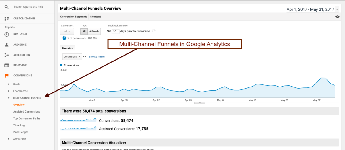
 As you can see in the “Overview” tab above, Multi-Channel Funnels allows you to analyze which channels provided the most conversions as well as to identify channels that assisted with conversions over multiple user touchpoints.
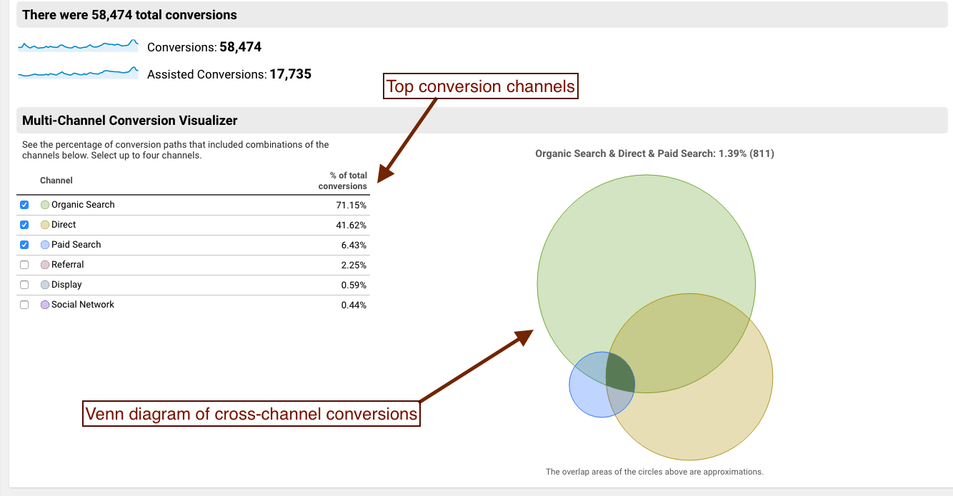 One of my favorite features of the “Overview” section is the Venn diagram that displays top channels along with the overlap where one channel assisted another in driving conversions. This is a great snapshot that allows you to easily see which channels routinely assist each other, along with channels that are under-performing.
In the “Assisted Conversions” tab (see example below), I like to sort by Source / Medium…and don’t forget to include all rows! This is great for identifying the individual sources that assisted most on the conversion path, including other websites, social media pages, paid advertising, etc. What I find sometimes in this data is that there may be a referral source like an affiliate, partner website, or off-site blog that doesn’t necessarily drive a lot of conversions by itself, but is tremendously valuable in ASSISTING with conversions. For instance, someone might find you on an affiliate website, click to your website, not buy your product at that time, Google you later…and then convert. Therefore, any one of those sources has more value than you might take it for at face-value when looking at your conversion numbers for that specific source.
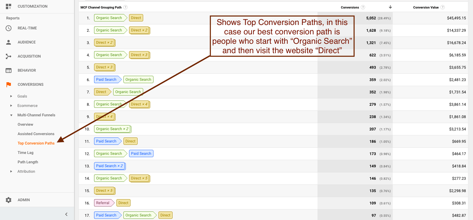
 Inevitably, there will be some conversion paths your customers take that are more effective than others. For instance, do people typically start by clicking on an Google Ads ad, then later visit from Google search and convert? Or do they start with Google search, then visit your website by typing in your URL, and then convert? Or do they start by visiting one of your social media pages, and then Google search, and then convert? These questions can be answered by viewing the “Top Conversion Paths” tab (see example below).
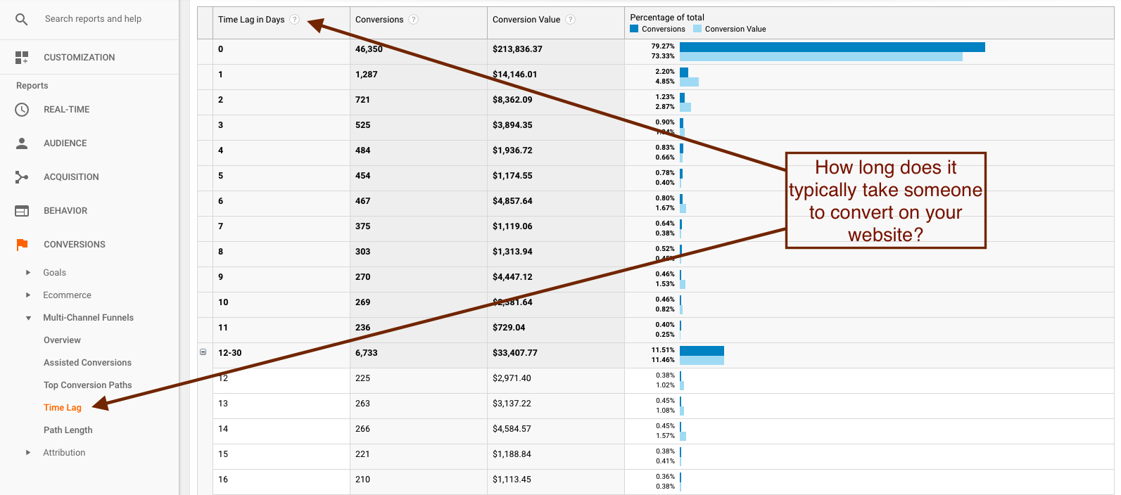
 The “Time Lag” tab allows you to understand how long it takes people to convert on your website. Do most people convert immediately after visiting the site? Does it take them a few days (and a few touchpoints)? Do you receive conversions a week or even months after an initial visit? You can take this data and use it to optimize your Remarketing and/or marketing automation to greatly improve their effectiveness (see example below).
 The “Path Length” tab allows you to view how many interactions it takes before one of your visitors converts. For some companies, a majority of conversions might happen on the first visit to their website. For others, it might take two, three, or ten interactions until your customer converts. Use this data to better inform how, when, and how frequently you interact with your customers online (see example below).
 Want to find out what your current best-performing traffic sources and digital marketing efforts are? Contact Ice Nine Online and let us figure it out.
Share this Post
